At my first job, I worked with a web component based library called Polymer. I remember my coworkers dreading having to work with this library and the intimidating “Shadow DOM.” After moving on from that position, I revisited web components and Polymer, and it completely changed my perspective. The ability to create isolated (which can also be a drawback) and reusable components without needing to download a library is truly awesome! The idea of building close to the browser is something I have since come to appreciate about web components and Polymer. That’s why I’d like to share how to create your very first web component.
What is a web component?
Web components are a blend of multiple technologies that allow JavaScript developers to create custom “components” that look and behave like HTML elements. Google introduced the concept in 2011 and created Polymer in 2013. While web components have not been fully adopted by the mainstream, there is ongoing debate about whether they will eventually surpass other JS frameworks like React and Angular.
Key technologies used for web components:
Custom Elements:
- Allows developers to define their own HTML elements.
- Provides a way to create reusable components with lifecycle callbacks (connectedCallback, disconnectedCallback, etc.).
Shadow DOM:
- Encapsulates the DOM and CSS of a component, preventing styles from leaking out and external styles from affecting the component.
- Enables scoped styles and isolated DOM trees within a component.
HTML Templates:
- Defines reusable HTML fragments that are not rendered until they are explicitly instantiated.
- Helps in creating efficient and modular markup for Web Components.
How to build a web component
Define the Class:
- Create a class that extends
HTMLElementto define the custom element.
class MyComponent extends HTMLElementAdd Constructor:
- Call
super()to initialize the parent class (HTMLElement). - Attach a shadow DOM to the component with
this.attachShadow({ mode: "open" });. - Create a
divelement and store it inthis.container. - Append the
divelement to the shadow DOM.
constructor() {
    // Must call super constructor in derived class before accessing 'this' or returning from derived constructor
    super();
    // Attach a shadow DOM to the component
    this.attachShadow({ mode: "open" });
    // Create the element
    this.container = document.createElement("div");
    // Append element to the shadow DOM
    this.shadowRoot.append(this.container);
}
Add Lifecycle Hook:
- Define the
connectedCallbackmethod, which is called when the element is inserted into the DOM. - Call the
updateContentmethod withinconnectedCallback.
connectedCallback() {
    this.updateContent();
}
Add Custom Method To Update Text Content:
- Define the
updateContentmethod to update the content of thedivelement. - Set the text content of
this.containerto “Hello, World!”.
updateContent() {
    this.container.textContent = "Hello, World!";
}
Register the Custom Element:
- Use
customElements.define("my-component", MyComponent);to register the custom element with the namemy-component.
customElements.define("my-component", MyComponent);Full Code:
class MyComponent extends HTMLElement {
    constructor() {
        // Must call super constructor in derived class before accessing 'this' or returning from derived constructor
        super();
        // Attach a shadow DOM to the component
        this.attachShadow({ mode: "open" });
        // Create the element
        this.container = document.createElement("div");
        // Append element to the shadow DOM
        this.shadowRoot.append(this.container);
    }

    // Lifecycle hook that's called when the element is inserted into the DOM
    connectedCallback() {
        this.updateContent();
    }

    // Custom function
    updateContent() {
        this.container.textContent = "Hello, World!";
    }
}

// Register the custom element
customElements.define("my-component", MyComponent);
Add it to the DOM:
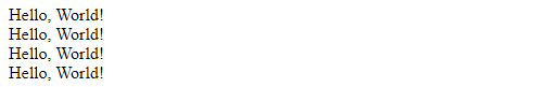
<!DOCTYPE html>
<html lang="en">
 <head>
  <meta charset="UTF-8" />
  <meta name="viewport" content="width=device-width, initial-scale=1.0" />
  <title>My First Web Component</title>
 </head>
 <body>
  <my-component></my-component>
  <my-component></my-component>
  <my-component></my-component>
  <my-component></my-component>
  <script src="my-component.js"></script>
 </body>
</html>
Produces:
Key Accessibility Tips
It’s important to remember that web components are treated like span tags in the browser and lack semantic context. Therefore, add ARIA roles and attributes to provide necessary information for screen readers and assistive technologies.
- ARIA Roles: Define roles to specify the purpose of your custom elements.
- Labels: Use
aria-labeloraria-labelledbyto describe the elements. - State Indicators: Use ARIA states and properties to communicate dynamic changes.
- Keyboard Navigation: Make elements focusable and operable via keyboard.
These steps ensure your web components are accessible and usable for everyone.
Summary
Web components provide a standardized way to create modular, reusable pieces of UI that can be used across different projects without dependency on large frameworks. They help in building applications that are easier to maintain and scale by promoting encapsulation and isolation of component logic and styles. Web components also work natively in the browser, ensuring better performance and compatibility across different environments. By mastering web components, developers can create more efficient, maintainable, and scalable web applications.
Dive into the world of web components and start building your own custom elements today!